Wednesday, 23 December 2015
Sunday, 20 December 2015
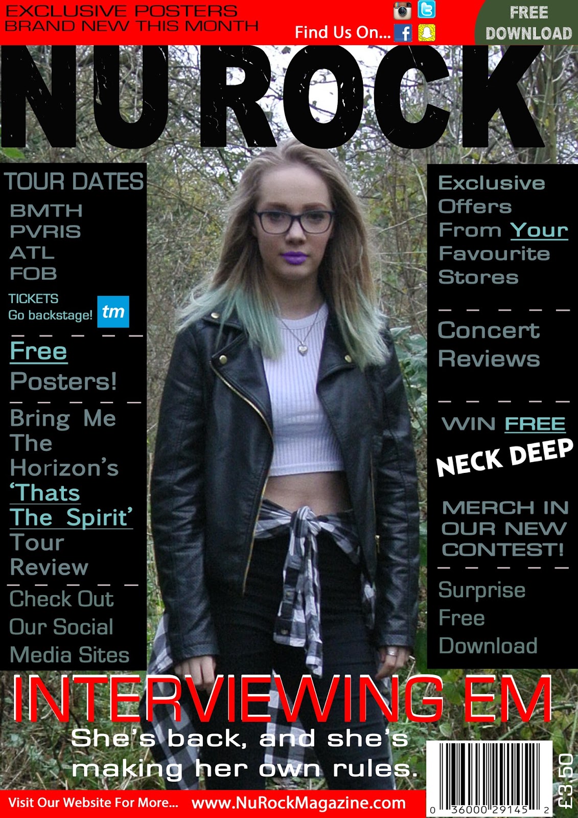
My Music Magazine Content Draft 4
In this draft, I have added some more information along side the pictures to inform the reader on the contents of each article, I have also moved the posters down to underneath the writing for the articles to make room for an editors note, I thought that this would make the magazine seem more relatable as the editor is getting involved with the audience.
Saturday, 19 December 2015
Target Audience Research - Drafts Of Cover, Contents and DPS
Can you identify the music genre from the front cover? Please write it below.
Six out of seven people who answered my research said that they identified my magazine as a rock genre, the final person identified it as pop rock, these results show that the way the magazine looks represents my chosen genre.
Is synergy created between the pages? How?
My audience recognised how singers was created through the use of the same colour scheme used through the pages, along with some of the same fonts. I feel like there is more that could be done to create synergy, one person suggested also adding the magazine web address and name should be added to the contents as well as being on the cover.
Are there iconic, symbolic or indexical signs? What are they?
The guitar silhouette I used over the page number has been recognised by the entire audience that took part in my research as being an indexical symbol. The dark colours also have been stated as a symbol of rock, along side the leather jacket the model is wearing on the cover.
What do you think the TA is? Age? Gender? Ethnicity? Sexuality?
My research shows that the expected audience based on my current drafts are aged 16-20 although some said a little older, e.g. 25/26. Age 16-21 was my initial target audience so it shows that my magazine is reaching my intended audience.
What representations are created?
The theme of rock is represented through the use of black and white/dark colours used throughout the pages. Leather and ripped clothes also represent a rugged and rock theme. One comment said that there was only a feminine representation and nothing that would attract males so I will work on adding more features aimed at men to expand my target audience.
Is the language formal, informal or a mixture?
The target audience has described the language used as mainly informal as it is aimed at a modern audience, there is some bad language used as this is a feature of rock which could cause it to seem more informal, some also said there was a mix of formal and informal language.
Is there anything missing? Anything you would like to see added? Are there changes you think should be made?
The changes people suggested that I make were to make my price on the cover smaller, and also lower it slightly as a teenage/young adult audience would not want to pay so much for a magazine. It was also stated that I should fill the space on the contents page as in this draft I had not yet finished the contents fully, the audience also said I should add pictures which I intend to do as I progress with my contents. One suggestion said I should lighten the models face on my cover so I will edit this photo to see how it looks. It was also commented that the stand first in my DOS was too small and there was no drop capitals so I will change this in my next draft.
Thursday, 17 December 2015
My Music Magazine Front Cover Draft 10
In this draft all I did was to add more social media links to the top of the banner to make the magazine appeal to a wider audience, also it is a music magazine so the logos I added are for music apps.
My Music Magazine Double Page Spread Draft 4
In this draft the bottom of the text has been rearranged to fit around the page number as this looks more professional and it looks a lot more modern.
My Music Magazine Double Page Spread Draft 3
In this draft I have changed the size and font of the title as it looked plain in comparison to the rest of the feature, I have decided to use a bigger and bolder font in block capitals so it will really draw the readers attention. I have moved the position of the white pull quote down a little so it does not distract from the model. I also realigned the text in the second column to make it more readable and more presentable.
My Music Magazine Double Page Spread Draft 2
In this draft I have added one of the edited photos from my photoshoot and also added another pull quote on top of the image. This quote is one I feel is important from the text and it stands out with the white against the metal background. The image, with the graffiti supports the rock genre and also the red of the graffiti matches the red text used.
My Music Magazine Double Page Spread Draft 1
Before I started using Adobe to create my DPS I wrote the entire feature out in word document to ensure I had atleast 800 words and so it would be ready with no mistakes for when I needed it. I split my A3 page in half to keep half for the image I had taken and half for the text, I then split one half into two quarters to create columns for the text to separate it slightly. I also ensured I used the same page markers (the red number inside the guitar silhouette) as the one used on the contents page to create synergy. The title is bigger than the rest of the text as it is the most important part. The red text at the top creates a brief summary of the feature which will help the reader decide if they want to continue reading this article or not. A pull quote is used to separate the text as it was all in a block and looked boring and teenagers would not want to read that much writing without it being broken up. The same red and black theme is used from the cover and contents to further create synergy.
My Music Magazine Contents Draft 3
In this draft, I have added the final photo of the male band I wanted to use, I also changed the colour of the puff to a bright and bold pink to ensure it really catches the readers eye. I have added a section on social media and the names of the accounts so people can find them easily and keep connected in a multimedia world.
My Music Magazine Contents Draft 2
In this draft of my contents page, I have added the date and issue number at the top of the page, this should be included in every issue of the magazine to show convention. I have also added more pictures that I have edited to look like posters for the audience to keep, along side this I have added above the pictures, the name of the feature that is being shown to make it clearer. To fill some white space, I have added a puff to advertise a special offer to make people buy the magazine monthly, not just as a one off, I made the puff the same colour as the blue in one of the Bring Me The Horizon photos however I am not entirely happy with this colour as it is rather light and plain. Also included is some social media advertisement and a link to the magazines website so people can find more information.
Wednesday, 16 December 2015
My Music Magazine Contents Draft 1
This is the first draft of my music magazine contents page, initially I had planned to do a two page contents however I knew there would be too much blank space to be able to make the page look professional and attractive. In this contents, I split the page in half, the first half is the pictures which are linked to the main articles in the magazine with the page numbers underneath them, I have not yet included all of the photos as I still have one photoshoot left to do and some pictures to edit. The second column is a list of the features included in the magazine, split into different sections so people can find what they are looking for more easily. Synergy is created between this page and the cover by using the same red and black colours, the same fonts and the same models. An iconic symbol of the guitar silhouettes in the corner show the rock genre and make it even more obvious.
My Music Magazine Cover Draft 8
When I went back to edit my cover I had decided that the music and contents that will be in my magazine wasn't metal and so I changed the masthead to NuRock as this is more my genre than metal music. I also made it a different font as my old font in the masthead wasn't large or bold enough and I could not get it any bolder so I chose this one as it is really bold and it has the patches in it so it looks rough and jagged which represents the rock genre. I added the TicketMaster logo to the cover to include more social links and also so people know where to buy their tickets for the tours included in one of the main articles.
My Music Magazine Cover Draft 9
I didn't do much to edit this draft of my cover as I was really happy with the way it looked, the only problem I had was that I was not happy with the Free Download pug in the top corner, I felt like it didn't match the cover and it looked out of place and messy, to remedy this I colour picked a green from the leaves in the back ground and rubbed out some of the shape so it fitted better in the banner across the top, I also changed the pricing as my target audience research said it was too expensive.
Monday, 14 December 2015
Sunday, 13 December 2015
Saturday, 12 December 2015
Wednesday, 9 December 2015
Organising My Shoot
After changing my model due to cancelled plans and conflicting schedules I had to change the dates and times of my plans, the rest of the information on my plan was still correct for example the clothing request and the location.
To organise my model I arranged a time and place to meet
Emily. We chose to meet at school on Tuesday December 1st after college for the shoot for my front cover as I wanted
it to be a studio shot and this would be taken in the drama studio with a black
background and artificial lighting. I asked her to wear all black and have a
winged eyeliner look to create a rock based look to match my genre.
The prop I used for this shoot was a microphone which will
not be visible in the shot as the model was holding it rather low and the shot
will be cropped to be a close up when it is posted on my cover.
For the shoot for my DPS we again, met at school on Wednesday 2nd December in the afternoon as we both had study periods and then
walked to the abandoned train tunnel I had previously found upon exploring for
locations. I didn’t have any artificial lights so the light used was all
natural. In the plan I gave Emily prior to the shoot it requested she wear ripped
jeans and a leather jacket (iconic conventions of rock) with a white top. She
also wore a checked shirt tied around her waist as this is a modern fashion
trend and it will appeal to teenage girls as they will or will want to dress
like this. Emily’s hair is blonde with a blue/green dip-dye which creates a
statement and it looks unique and trendy. I didn’t use any props in this shoot
as I wanted it to look more natural.
Tuesday, 8 December 2015
Photoshoot Plans
These are the plans I created to ensure I had everything sorted out for my photo-shoots for my cover, DPS and my contents page.
After these plans were written my model for my cover (Maddy) couldn't make the date we had set and was unable to make another time due to work and college times conflicting so I made a new cover plan to suit my new model (Emily).
My Music Magazine Front Cover Draft 3
After receiving feedback on this draft I have been told that my masthead is too long and it needs to be one word. I have also been told to do another photo-shoot to make my model look more rock and have her wear dark lipstick, make her hair brighter and bigger and have her wear a choker or something more rock than a nice necklace.
Subscribe to:
Posts (Atom)