Thursday, 26 November 2015

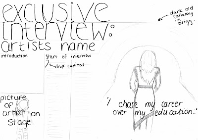
My Double Page Spread Article


Bold Text - interviewer
highlighted text - pull quotes

Rock sensation Em took the music scene by storm when she released her controversial, yet astoundingly popular new single ‘Liquefied Strength’ after being incognito for almost three years! We get to know the girl behind the music in an exclusive feature of her very first interview since her return.

What is your earliest memory of music?
The first thing I remember is when I was little, my dad took my mother and I away on holiday, it was to one of those holiday camps with the show on at the bar every night, the first night it was a kids disco, I remember dancing around the floor, singing at the top of my voice, and thinking ‘I never want to be anywhere else’

Who do you credit as introducing you to the kind of music that has shaped your career?
Before my break, I would have said maybe Paramore, they were always an inspiration to me, but as I’ve grown up and thought about who I really want to be, I don’t want to be like people that are already around, I don’t want to have to be compared to people, I want to be able to define myself.

Do you think rock music could ever end up having the same recognition as pop music?
I feel like it is becoming more recognised and more popular but personally I think that we need more ground breaking and modern acts in the genre before we can really break through the barrier that’s been built around rock. I think more and more stereotypes and preconceptions are being proved wrong daily so it shouldn’t be long before we’re being nominated at the Brits Awards.

The sound of your new music is significantly different to your last albums, is there a reason why?
When I was making music before, I was still a teenager. My old label and my managers were able to tell me what to do and what would sell and I would listen, but it gets tiring being the media’s puppet. That’s why I needed time off, to really figure out who I wanted to be, it was sending me bats**t crazy. I’m going to make the music that I want to make, the sales aren’t important to me. It’s more important to me that I stay true to who I am now, this is the time people get to know the real me, whether they like it or not, I don’t really give a f**k anymore.

A lot of your fan base try to look like you, they do their hair and make-up like yours and buy the things you do, do you think that this makes it even harder to be your own person if other people are going to do what you do?
I guess you learn to block it out, at first it’s nice to be able to influence people, to be their idol, but I don’t want people to think they should be like someone else, everybody should do their own thing and find their own identity, if that is like mine then that’s great but it shouldn’t feel forced. Growing up my sister listened to whatever bands I would listen to, even though the content was far too mature for someone her age, she wanted to be like me, and I was worried she wasn’t becoming her own person and she was just becoming another me.

Have your friends and family supported your decisions?
Some did, some didn’t. My parents and siblings have always supported me and wanted me to be happy, my wider family were never that close until I started getting my name out there. It’s hard to know who is there for you and who is there for your bank account. When I took the break, some of my friends showed that the end of my money flow meant the end of our friendships, but now I know who is real and who is fake, it all worked out.

It’s rumoured that you’re planning on bringing out a multi-million pound clothing range, any comment on that?
It honestly sounds like a sick idea but I don’t think I’m even fashionable enough to dress myself never mind influence other peoples clothing choices. The idea of it would be a lot better than the reality of it. The money wouldn’t really inspire me to pursue the idea, I’m lucky enough to not have to worry about money so if I were to do it I’d want it to have the proceeds going to charity.

A lot of your fans were getting rather excited about it, you must influence their fashion choices in some ways?
I didn’t realise people actually liked what I wore, my wardrobe is mainly a combination of other artists brands (like Oli Sykes’ DROP DEAD Clothing) and some bizarre items I find in charity shops. I’m actually so happy they like my clothes, it’s really unexpected.

And finally, what can we expect from you in the near future?
I’ve recorded a few songs that I’m really happy with and I’m currently in collaborations with some inspirational artists to help me write some more. Hopefully soon I’ll have enough to release an album, well, that’s if people actually want to buy my music! I’m not in any rush, I’m just enjoying being back in music and taking it all in, as myself this time, not who I’m expected to be.

Wednesday, 25 November 2015

My Music Magazine Cover Draft 2


This is the second draft of my music magazine front cover. I have amended how basic the 'interviewing Em' looked by adding a red lining to the words so it matches my masthead and links the page together instead of making it so it looks really thrown together and messy. I also moved the masthead up to make more room for the photograph. I moved the article description so I was able to fit in the barcode which is necessary to have on a magazine to make it purchasable. I rearranged my articles along the sides so that they weren't as cramped but I am still not sure about the colour of the background. I used the colour picker to pick up a colour from the picture from the Bring Me The Horizon concert to use for the rest of the text.

Tuesday, 24 November 2015

My Music Magazine Front Cover Draft 1

Initially, my model was going to be Maddie McDonald however our schedules conflicted a lot and there seemed to be no appropriate amount of time for us to carry out a successful photo-shoot for a cover, DPS and some for the contents page. This led to a change in model and I am now going to photograph Emily Britcliffe as my main model.


This is the first draft of my music magazine front cover, I tried to adhere to my plan as much as I could. I decided that I don't know if I like the colour of the background boxes along the side as it doesn't look as good with the red in the masthead (which I think looks really effective) as i imagined it would. I want to experiment with different colours here to find what looks best, I will try all the colours suggested by my target audience that they said they would like to see on a front cover. The writing at the bottom which shows the feature article looked rather plain in comparison to the rest of the page so I feel like it needed something adding to it, i added a red shadowing like in the masthead.

Monday, 23 November 2015

My Music Magazine Contents Draft 1


This is the first draft of my contents page of my music magazine, I tried to adhere to my drawn drafts however the title on my drawing is different to the one I have created here as this one looks less childish and more modern, this style also matches the red lining in the masthead and the dark background along the sides on the cover as both colours are used to line the word contents. This creates synergy. There is a space between each letter which means the word will cross the centre line and cover both pages which will break convention as this will make the page memorable and unique as other products do not have this.
The contents is split into different sections as to separate the different types of articles in the magazine as some people will want to read the magazine for certain reasons. Blumler and Katz's theory is applied here as we buy magazines and media texts to diverse and for diversion, to escape into different places. This is why I separated the articles, to make the things people know they want easier to find amongst the many features in the magazine.
The blank boxes are where the photographs I am going to take will go. One photo is going to be a group shot of three girls in modern and affordable clothing that would appeal to my target audience. One will be an image of the artist featured in my double page spread. Another will be a photo of a male on a stage (maybe an image from the Bring Me The Horizon concert I am going to which is mentioned in the contents page). Finally, the last image will show a group of males in an outdoor shoot posing as an upcoming indie rock band. I came across these images online and I like the style of posing and I will take influence from these images for the last photograph on my contents. From the first one I like the background and the simplicity of the idea, I also like the way they are dressed as they look quite rock but I would want darker colours in mine. From the second image I like the way they are stood as it looks more natural and more indie and unique.

Thursday, 12 November 2015

Target Audience Research Analysis


Target Audience Research Analysis from caityduggan

The Blumler and Katz theory asks why people actively seek out specific media outlets and content for gratification purposes. This could be applied to this as in slide 12 the audience could be reading the magazine in order to find out about concerts and gigs to go to and see reviews.

Wednesday, 11 November 2015

Target Audience Research - Social Media

To get a wider range of people answering my questions, not just people in my media group or close friendship group, I posted on Facebook to ask some of my friends that live a little further away or people who are different and have other views than the people I am surrounded by daily.


Luckily quite a few of my friends were happy to get involved and so I was able to send them a picture of the questionnaire I had made and send it to them, they then typed out their responses to each question and sent them back to me as shown below in the screen shot.


After I had a few responses on Facebook I tweeted and asked if people were willing to fill out a survey for my media work, a few people replied meaning my research base was expanding and making my magazine more national. The screen capture below is from the response of one of my friends who wanted to help me out.


This research really helped me understand the views of people aged 15-22 and also how the views differ due to gender and age group and even location.

The use of social media has informed me of what my target audience thinks of the features that are a part of existing products and which ones are viewed positively, giving me an idea of what I should include in my magazine to appeal to them. It has helped me decide to use a female model on the front cover, to include an interview as my double page spread feature and to use dark yet bold colours to reflect the theme.

Friday, 6 November 2015

Contents Page Analysis 5

This contents page is from the magazine 'Clash' as shown by the masthead which is in the corner in tiny font. This magazine mainly features articles based on film, fashion and music. These subjects help the magazine stay modern and up to date as new music, films and fashion trends are coming ad going frequently, meaning every issue will be different but still stick to the iconic conventions. The page follows quite a conventional grid, as each page is clearly divided into two sections: text columns and supporting images. This makes the content page, although seemingly busy with text and images, look neat, well-structured and readable. There are 3 text columns representing different features of the issue: features (one off articles for this particular issue), regulars (regular articles featured in most/every issue) and fashion. This is more commonly aimed mostly at a female audience, but also appealing to male readers as their target audience is all genders.
The san-serif font used to title the contents page is also used to title the articles and is used on the puffs to label the page numbers.


The supporting images around the side of the article titles are a basic square shape, which adds the accuracy and simplicity along with stylish look to the contents page. The main image, showing the cover story, is bigger than other images, but is still not all that attention demanding, this is used so to persuade the audience that it is not the only feature of the magazine and that other articles are also significant, therefore, would also interest them.
The contents page has a very obvious promotion section, which represents free music download. This is done in order to attract the audience and encourage it to buy the issue. This is used in many issues of 'Clash' magazine and so has become a convention for their magazine.
 All of the pictures on the contents page are marked with the page number in a coloured puff. The colour of it matches with the gender of an artist presented on the photo, except for the circle attached to the main image, which is red in order to immediately draw people’s attention to the main magazine feature.
 
The overall colour palette is black and white, which looks simple and clear. Other bright blue and pink colours add energy and style to the pages and suggest that this issue is based on more on pop music. These vibrantly coloured elements look a bit like sweets lying all over the page, appealing to the people, who are mature enough to be interested in such music and style, but, obviously, are young and energetic like the colours used.
The pink colour used in the banner above the fashion section and in the puffs is the same colour as the top that Wanda Jackson is wearing in the photo representing the article written about her, this is linking all the page together instead of using random colours.


Wednesday, 4 November 2015

Rock - Magazine Double Page Spread 8

This double page spread is from the modern and popular rock magazine 'Kerrang! and it is based on the rock/metal band 'Bring Me The Horizon'.'This is identifiable as the magazine's masthead is in a small font in the bottom right corner, this is on every page in each issue and so has become a convention of this magazine brand. The font used is very very small so it is not distracting from the feature but it is noticeable enough to keep reminding the reader of the brand.
At the top of the right hand page there is the name of the band in the same size font as the pull quote from the interview, I would have thought this would have been the official Bring Me The Horizon logo but that font and colour would have made the page look messy and un-organized so the way they have produced the magazine is very efficient.
The chart at the bottom of the first page reads 'can you feel my chart' which is a play on words as one of Bring Me The Horizon's most famous songs is called 'Can You Feel My Heart' this secures the audience as mainly people who are fans of the band as not only will they be reading an entire feature on them but they will also understand the joke which will add an entertaining tone to the otherwise rather serious piece.

The serious tone of the piece is immediately shown through the pull quote taken from the interview which reads 'I started to feel like the band could be over...' and this quote was taken from the lead singer which only highlights how severe the situation must have been. This suspense filled quote will intrigue the reader, especially existing fans as they will want to read about what was so bad one of the most popular metal bands nearly broke up.The text is also in red which stands out strongly against the background, but the red could also represent the severity of the situation.
The drop capital at the start of the article is showing the reader where the text starts and draws more attention than the rest of the text. Throughout the text there is a lot of speech and quotes as it is an interview with the band and this creates a more intimate feel for the reader as it is direct, reliable and real words by the artists themselves not just what is being written by a writer who knows little about their experiences.
The purple used at the top of the pages is the same colour used on the jumper of one of the band members. This also happens with the colour of the chart and the top of the lead singer as the red/burgundy is the same shade.This creates a link between the features on the page and makes it look neat and well put together instead of having different colours spread around the pages.
The photograph used for the article breaks convention as it spreads onto both pages whereas usually the picture will take up one full page, maximum. The magazine also breaks convention as the pages are slightly larger than the usual A4 size but these broken conventions have become conventions of this brand.
I like the use of body language in the image as it suggests searching for something or maybe pushing something away, this could even be seen as them trying to hold onto the band after their near break-up. I'd like to try and make a link between the body language in my photography with the purpose of my text as the subtle links make the work more interesting.

Contents Page Analysis 4


This magazine contents cover if from the popular teen music magazine 'WPop.'
The style of these contents pages is always the same, they all include the 'We  Pop' masthead (the name of the magazine inside a white banner) in the top right corner, the title of the contents is always 'WE LOVE THIS...' and the main feature story is always placed in the middle of the page, bigger than the rest of the features, as shown in the photos below...


These features are what makes the magazine easily identifiable as it is not that much of a well known magazine and so the constant codes and conventions used with this magazine will start building up a memorable image and the brand will soon be recognisable.  
The magazines masthead is easy to recognise due to the heart emoticon which makes it more modern as teenagers nowadays use 'emojis' on their phones and computers all the time in modern society. It also makes the masthead a bit more fun as most are just writing but the heart breaks up the writing with some colour as opposed to the rest which is just black san-serif writing in a black speech bubble on a white background. The use of the speech bubble adds a more personal touch to the writing as it's like the author is saying that they love pop and they want to share it with the reader, creating synthetic personalisation
The main feature's page number on the contents page is always white but the background is always a shade of gold or a gold/yellow colour. This could be highlighting the significance of the article, like awarding it a gold medal at the Olympics as it is the best feature. The other articles that are featured with pictures usually have the same coloured puff for their page numbers but they can sometimes be slightly more yellow than gold.
                                

Only the articles that the producer deemed to be the most important features have pictures along side them, this draws more attention to them as there is colour and visual aid to break up the blocks of text because the reader will not want to read massive amounts just on the contents page as it is not part of the actual reading and the audience is supposed to be teenagers who will not want to waste their time reading things that won't appeal to them.
This contents page only really features three main colours: white, blue and gold. These colours create a nice contrast as blue is quite a cold colour but gold is a warmer colour. In addition, blue is generally known as a more boyish colour while gold is rather sparkly, leading to it being thought of as more of a feminine colour, and white is a very plain and neutral colour, this will mean the magazine can appeal to all genders. There is small sections of other colours, such as in the photo next to the article about JLS, Marvin from the band is wearing red, the same red that is featured in the heart in the masthead in the top corner.
Near the bottom of the page there is a banner which highlights the free products included with this issue of the magazine, in this case there is free posters. The banner shows a small version of all of the posters in the magazine to give a brief view of what to expect and to excite the reader about what is to come in the magazine.
In a banner along the bottom of the contents page there is the magazines website which will further promote the brand, but also help the reader as there may not be some information they would like in the magazine or they may have questions or want to subscribe to the magazine so including the website is a smart business idea and it's one I would definitely use in my own music magazine.


Double Page Spread Analysis 7


This double page spread is from Kerrang! magazine and is based on the band Biffy Clyro. This is a modern and popular light rock band.
This double page spread is featured in Kerrang! magazine as they are a popular band, especially with people who listen to the type of music written about in this magazine and so they know that this particular band will attract readers and sell a lot of copies of this issue. The reader can see that the double page spread is from Kerrang! as in the bottom corner on a puff, in a small, and non-distracting sized text it shows the masthead next to the page number.


The article headline 'Demons Be Gone' gives an idea that the article will mention how the band have struggled with certain things. The article delves deep into the personal lives of the band members and reveals that one members metaphorical 'demons' means the severe depression that member Jim has been facing which has affected his band mates and also his performance, this is mentioned as he is trying to rid of his demons as the headline says. The colour of the headline is red, this colour signifies blood and danger which links to the ideas of demons and hell. The font used is rather sharp and jagged which suggests a sense of danger. The size of the text is very large and this could show the large amount of 'demons' they have to fight or the size of the battle they have faced.

The idea of the bands 'demons' are presented by the picture as the lead singer of the band Biffy Clyro is looking in the mirror but the reflection in the mirror is not the same as the original, the reflection looks more out of control, wild and dangerous which is what demons are. The background of this image is a plain white so the main image and the text are more in focus and the background isn't taking away the attention from the main features. The fact that the singer is shirtless in the photo shows his tattoos and highlights the rock genre that his bands music shows, but it could also suggest that the interview is vey personal and that the band are 'stripping' themselves of their rockstar images and showing their true struggles. This image presents the theory of Dyer as the director wanted the artist to pose in this way to support the headline that had already been written to sell the article.
The photograph spreads across both pages, this goes against conventions as usually the image takes up one page maximum. This then suggests that the article is different to others and may be more personal as it is mainly about this band and their experiences, it could also suggest that due to the lead singer taking up so much space, one of his 'demons' could be that he is selfish. 
 The text used in the DPS represents the genre as there is explicit language used which represents the rock genre and the rough and rocky style.


The text also tells the reader that James McMahon interviewed the band regarding their “long, hard road out of hell”. The lexical choice of ‘hell’ here suggests that the article is dark and displays their struggles throughout their bands existence, encouraging readers to find out more about their struggles and what they actually entail and links back to the headline regarding their 'demons'.
The main article begins with a drop capital, meeting conventions of magazine articles. The choice of a bold red complements the colour scheme of the piece and encourages the house style. Drop capitals are used throughout the piece after every three or four paragraphs. This could connote each stage of their journey.


At first glance there are a few quotations and speech marks used throughout the article suggesting to readers that the article is full of stories and anecdotes from the band, meaning the article would be interesting and include the reader in the bands journey to beat their ‘demons’ as the headline first said.
The font used is also a symbol of gothic horror which relates to the headline article as it mentions demons which are symbols of horror too. In my magazine I want the headline to link to the style of text and the rest of the double page spread as to link everything together instead of it all looking messy and thrown together.

Tuesday, 3 November 2015

Magazine Double Page Spread Analysis 6

This double page spread is from the teen music magazine, 'Top Of The Pops. This double page spread is about Justin Bieber, a popular and modern music artist.
As this double page spread is an interview, a pull quote is used as the title across the two pages, attracting the readers attention, and making them want to read the article if they have an interest in Justin Bieber or just modern music stars and their lives. I would want either the headline or pull-quote to go across both pages of my own magazine.
The article is written in columns, making it easy to read which is another convention of double page spreads meaning the layout used is quite traditional and well known. This double page spread looks similar to others in ‘Top Of The Pops’, showing a convention of this brand and reinforcing the brand identity.
The article adheres to red and black; eye-catching, but doesn't put the readers off the article by being too overwhelming to be able to see the actual words through the excessive colour display. The black and red theme is continued onto the artist himself as his top is black and his trousers are the same red used through out the article.
The headline used on this page is a pull quote from the interview, ‘girls give me a headache!’. This tells the reader that in the article, Justin Bieber will be talking about girls and his opinions on certain girls; this would attract the attention of the target audience, especially the girls because they would be interested in this as Justin Bieber is an attractive singer within the pop music industry. Bieber giving his opinion on girls would also lead to the readers wanting to find out what he thinks and why girls give him a headache. The exclamation mark gives off a sense of excitement, making the readers want to read it even more which is a smart idea. A serif font has been used, as this is more feminine, reflecting the target audience and readership of the magazine. This font is commonly used in Top of the Pops, cementing their brand identity.
The main image is of Justin Bieber, and takes up the whole of the right page. This image of the artist directly addresses the audience as he is making eye contact in the long studio shot, which draws the reader into the magazine and this article. The mise-en-scene is very bright; he is wearing a black vest, red trousers, black shoes and a silver chain and bracelet. This shows his wealth, and reflects his star image but also makes him look like the stereotypical modern boy which will appeal to the modern female audience but a lot of males also idolise Justin Bieber due to his style and his music which widens the target audience, the photograph used also reveals his tattoo to the audience, because Bieber is sitting on the chair backwards, this suggests his playfulness, represents his youth, and the fun genre of pop and the music he makes. The chair is made of clear material, so no attention from him or the article is taken away. This image also creates a more relaxed and informal feel to the interview as he looks calm and relaxed. This image also shows off Justin Bieber’s arm which are quite muscular and this shows of his more masculine side, and would attract the female target audience.
The only other picture used in the double page spread is used to separate the text and also links in with the text as the pull quote mentions girls and the photograph shows Justin's then girlfriend with him. This immediately infers that his relationship will be mentioned which will attract teenagers as many are fascinated with gossip of celebrity relationships. The photo is captioned 'Biebs takes an easy stroll with Selena'. They call him 'Biebs' which is a nickname inferring they are close to the artist or that he is a friendly person. The relationship between Justin and Selena could suggest why the colour red is used throughout the article, because red signifies love.

Target Audience Questions

This is the questionnaire I designed to give to people who fall into my target audience, this will give me a better idea of what to include in my magazine to make sure it does suit the target audience.

Magazine Double Page Spread Analysis 5

This magazine double page spread is from 'Mayhem' magazine (the September 2013 issue). This is easily identified by the small print on the banners at the bottom of each page labelling the magazine name, page number and issue. This is a really smart idea as it is a constant reminder of the brand but it is also small and not over the top or in the readers face.

Another smart technique used in this double page spread is the synergy created by the colours as the red and white colours used are also used in the magazines masthead, as shown in the screen-capture shown below...
                     
The red used in the fonts could also represent the artist as her signature look is bold, usually with a bright red lipstick, this however is not used in the photograph used with the feature. The colour used is also a part of the Rita Ora logo (shown above), which is used for her albums and concerts in not only this colour but also the same font, this is used as it has become a convention for this artist and many people will recognise the iconic style which will attract people who are already her fans, but hopefully also people looking for new music as it is so bold and modern, almost a graffiti effect.

The red font also links to the first part of the text as the colour red is often linked in with the idea of hotness and the text refers to Rita Ora as 'The UK's hottest music star'. This is also represented in her clothing as she has been styled to appeal to the target audience and look 'hot' which complies to Mulvey's 'male gaze' theory.


In this long shot, taken in the studio, the singer looks very carefree and cool, which is what the director would have told her to do, this pose links to the clothes she is wearing which say 'wild' on the jacket many times, these link because the 'wild' nature of her clothes represent her careless attitude and the way she is cocking her head and holding her hand in quite a cocky way teamed with her untamed curls and the dark eye make up.


The background used is rather edgy and urban and this represents the kind of music that Rita Ora makes, this is creating an image about her in the readers mind and giving subtle hints about the kind of artist she is and what to expect from her. This is created as the director would want to sell the artist and also make the artist look good for the magazine which backs up Dyer's theory of 'a star is an image, not a real person' as she has been told what will work for the magazine and what will look good for her, she is not being her own person, she is being what will sell.

Research Institutions - Bauer Industries

http://www.bauermedia.co.uk/brands


I started my industry research by looking at the websites of different companies, the first I looked at was Bauer Media.
The website for this company is very modern. It is all purple/blue and white, all of the buttons are the same/similar shades of an indigo shade which all work together.
The first thing visible is the long list of Bauers existing products, it's an extensive list and while looking though this list I found that they are the producers of Kerrang! magazine which is a rock magazine, quite similar genre and target audience to the magazine I will be creating and so they will not want another product similar to an existing one, so this is not the right company for my magazine production.
However, the amount this companies products are advertised and how wide an audience they reach is something I should be aware of for my magazine as many of their products can be found online, in apps, in newspapers/magazines, on television or even a combination of different mediums. If I include this idea then I can reach a larger audience and instead of being a regional magazine, it could turn into a national product or even global with the right marketing.

Research Institutions - Egmont Industries

Their Website:
http://www.egmont.com/about-egmont/

Egmont industries has a variety of magazines already available, however there is none that fall into the category of magazine I have chosen to make and there is also no existing Egmont product available for my particular target audience.
Their website says their main focus is to influence more children to read and enjoy reading books and magazines, from toddlers to teenagers, I think this would be a suitable company to publish my magazine as they want to appeal to teenagers and that is my target audience, older teenagers.
The company sell over one million books and one million magazines a month so I know my magazine would be well promoted and in turn earn a lot of sales which would mean I could improve the quality of the magazine.
The company also regularly do research to see what children and teenagers are interested in recently and also keep up with important events and news to keep children educated and aware.
The photo along side shows just a few of the magazines run by Egmont Industries.
Egmont industries own a range of social media accounts which allow potential audience members to interact with the company and their products. The social media they use are among the same accounts that I would want to include for my magazine to allow the magazine to stay modern and interactive while allowing readers to keep up to date with the latest news and releases while waiting for the monthly issue to be released. Along side is a screen capture from the Egmont website which shows their social media links. These allow a range of ages to access them as the older generation audience may not have Instagram and Twitter and the younger audience may not have a LinkedIn account or use their emails frequently.
Egmont Industries is based in the Nordic region but they distribute worldwide which would be a benefit for my magazine as I could not only reach a regional audience but also distribute my magazine globally which would be an added profit and ensure a larger success rate for the magazine. Egmont develops apps, interactive games, digital communities, books and magazines for children and young people and I want to add a slightly older audience to this as they have a gap in their company for a rock magazine and this magazine could be an opportunity to expand their audiences and also their product range.